Independent Project (2024)
Wayfarer AI: Combining travel research, planning, and AI co-pilot
Timeline
April - Aug 2024
(4 months, on-and-off)
Role
Sole Product Designer
(Independent Case Study)
Tools Used
Figma
Miro
Whimsical
The Problem
Travel-planning is an overwhelming task. With a proliferation of information across many platforms, it takes more effort to research and plan trips suitable for different travelers.
The What-if
What if an app researches and creates itineraries based on your own preference? 💫
The Solution
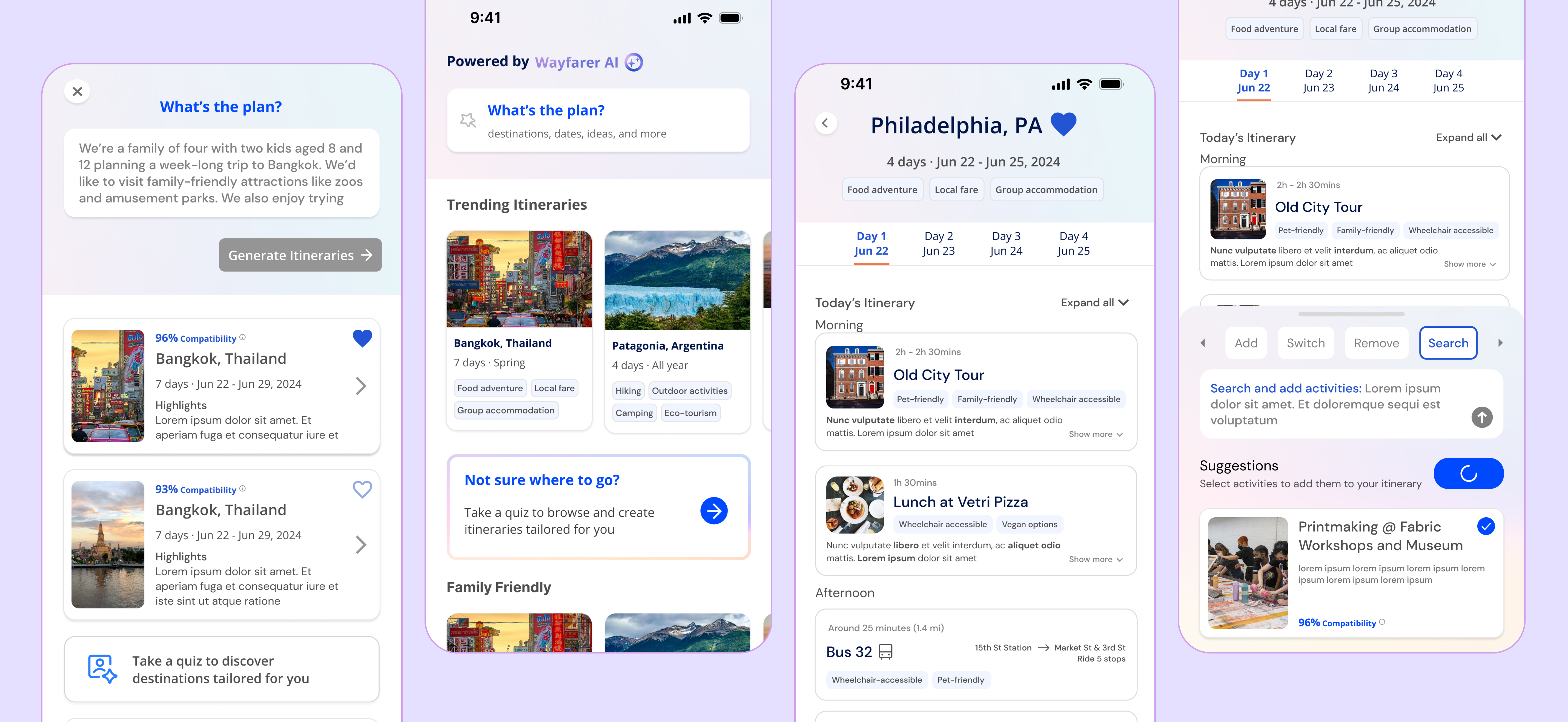
Wayfarer AI is an iOS mobile app that uses AI to enable travel research & planning at the same time. It generates itineraries suited to particular needs, making travel-planning easy, efficient, and fun.
It turns this boring ChatGPT thread


into an engaging, hassle-free travel-planning experience

Solution Overview
AI copilot and prompting to generate custom travel itineraries
Prompting the AI about travel destinations, preferences, and ideas will yield itineraries.
The process of prompting is guided by prefilled prompts and compatibility scores that explain AI suggestions.
Co-pilot with AI to edit itineraries
Within each itinerary, the user communicates with the AI to make changes to the itinerary.
Communication is guided by prompt suggestions. The co-pilot section of the screen further enables plan and search at the same time.
Enter a preference form to tailor recommendations
Users can fill out a preference form that helps communicate a variety of information with AI.
The preference form empowers users to explore tailored destinations and trips
01 Problem Definition & User Research
Initial Problem
How might we leverage AI to make travel-planning easier and more effective?
In my original PRD for the project, I wanted to leverage the ability of AI to search, synthesize, and generate to improving the existing process of travel planning. Hence my initial problem statement:

User Research
In order to scope my project and validate the user need, I conducted user research with 7 travelers with varied needs and experiences.
Here are the two questions I asked:
1. What is the process for their travel-planning? What do they care about?
2. How and why do people use AI? What can be improved?
Contextual Inquiry: ChatGPT

PRO
- Quick and dirty - for when the user just needs something
- Easy iteration through simple conversational mode
- Saves user’s time from searching all over the internet
CON
- Lack of visuals disengage the users
- Itineraries are not detailed enough to make users feel confident about execution
- Low credibility due to lack of detail
- Users are not given information to decide that they like or dislike the itinerary
Why not use ChatGPT?
In my interview, users shared being hesitant to adopt ChatGPT’s itinerary because of its lack of detail and transparency. Users don’t feel confident enough to execute the plan.
“where does it get all the information ... why is it giving me these instead of others? -- User #1
“I feel like I still need to do more research to actually use this itinerary. Traveling is a pretty important decision.” -- User #2
“This doesn’t help me mentally prepare for the trip. I need visuals and something more specific.” -- User #3
Insights and Opportunities
In user interviews, I found some common patterns and frustrations that posed opportunities for design.
Insight #1
Travelers gather pieces of information from multiple platforms, a time-consuming task
Opportunity #1
Creating more flexibility and enabling travelers to plan on-the-go
Insight #2
Travelers go through tones of research to know whether a place is suitable for them
Opportunity #2
Focus on incorporating travelers’ specific personal preferences and any accessibility needs
Insight #3
Users are anxious about using AI due to misunderstood instructions and ineffective results.
Opportunity #3
Increase accuracy by guiding the user’s interaction with AI
Problem Statement, Redefined
How might we leverage AI to create flexible and informed itineraries tailored to specific user preferences?
User Need Statements
I crafted user need statements to map out use cases of my product and generate more targeted solution. Using the format of a user needs [a need] in order to accomplish [a goal], these statements helped start ideating solutions.

User and Business Goals
I talked to senior-level designers to learn how an app like Wayfarer AI might generate business value: I learned that data solicitation is key to the business model of products like Instagram, Facebook, Google.
Other significant business goals include driving customer traffic and ensuring AI accuracy through user feedback

Design Direction
To flesh out how I might achieve my design goals, I broke my general HMW question into smaller statements that my design will address:
1. How might we encourage and facilitate the user to add specific preferences to receive tailored results?
2. How might we combine search and plan functionality to allow flexible discovery on-the-go?
3. How might we lower the energy cost of using AI tools to facilitate planning and discovery?
4. How might we create a sense of reliability through transparency and feedback between the user and AI?
The Happy Flow
In this happy flow, I focused on the core functionality of an end-to-end MVP:
- Prompting
- Creating an itinerary
- Saving the itinerary

Mapping Priorities
Using the MoSCoW method (must do, should do, could do, would not do), I mapped out prioritized features and content for each phase of my happy flow.

Ideating Core Interactions
In order to lower the energy cost of using AI tools to facilitate planning and discovery, my key design decision was to move away from a conversational model to a copilot model

With this in mind, I created the initial wireframe for the itinerary page:

- The itinerary itself is kept minimal but expandable to keep the interface clean
- An AI text message box is located at the bottom half of te page.
- Interaction with AI is still text-based, inspired by messaging app interfaces to make it familiar for users
- Users can still drag and drop to edit the itinerary:

Initial Mid-Fi Flows

04 First Round of Iterations
Usability Test for AI
In order to understand how users actually use AI systems and better guide them, I gave users a travel itinerary generated by ChatGPT and asked them to write prompts to modify the itinerary according to their taste.
Through a unique user study exercise, I figured out how to guide users in interacting with AI. Here are my design decisions based on what and how they wrote:
Design Decision #1: Guiding users through prompt suggestions
I grouped my users’ responses into common actions items that users input to change the itinerary: add, switch, and remove

Then, I added these action items in a suggested text bar in the AI panel
These provide guidance for users on how they might write specific and effective prompts to communicate their desired changes to AI.

Design Decision #2: Adding a search function
In order to combine search and plan functionality, I created an embedded search function that allows users to choose from search results and have control over decision-making.

Design Decision #3: Adding a "Ask" function
Edge cases are more difficult to consider without chatbot. One edge case is asking questions. Users want to ask questions like “can you tell me the budget of my trip?” and “What’s the weather like?”

Solution: An option to ask Wayfarer AI a question and receive an answer!

Design Decision #4: Toast notification for every change to the itinerary
Consistent feedback and communication are crucial to user interaction with AI. Without a way to communicate the AI’s actions, the user will always wonder: “Has the AI executed by request?”
Solution: toast notification every time the itinerary is changed.
Additionally, I defined the different kinds of toast notifications based on use cases and edge cases:

When the AI adds, removes, or replaces destinations, it indicates the change to the user.

Adding an undo button makes room for mistakes and flexibility.
Finally, in edge cases where the user enters a message the AI cannot respond to. A pop-up directs them to a help page.
Design Decision #5: Compatibility score to increase transparency
Users want to know how AI got it answers in order to trust it. I added a compatibility score with annotations to inform users which of their preferences informed the result.
05 User Testing and Iterative Design
User Testing
In this round, I want to gauge how navigable and learnable the interface is through a task-completion method, evaluating accuracy and efficiency:
Task #1: Make an itinerary
- ✅ Users’ instinct is to use the search box at the top of the page, which is easily visible
- ❌ User finds the specific prompts supplied unhelpful and distracting
Task #2: Use a preference form
- ✅ Clicks on the secondary CTA, leading to the preference form
- ❌ Confused whether their preferences have been logged
Task #3: Find your saved itineraries
- ❌ Could not find saved itineraries due to unclear symbols and navigation
Task #4: Find your saved preferences and edit them
- ✅ Most found saved preferences in the profile section
Information Architecture
User testing results showed that users did not find the flow intuitive due to redundant CTAs and and unclear symbols. I revamped the information architecture alongside clear icons.
The new nav bar uses clear symbols to delineate the core functions of the app:

and a new IA that prioritizes the core flows, making the product more understandable:

Design Decision 1: Preference form with multiple entry points
In the initial prompting page, I placed real prompts used by other users to help guide others to prompt. In user testing, users found these prompts irrelevant and too specific. I pivoted to themed prompts instead:
Themed prompts give users an idea of what the AI can do. They also help users brainstorm prompts with effective contexts like duration, style, and accessibility needs.

Design Decision 2: Preference form with multiple entry points
Because soliciting user preferences is one key objective of the app, I want to make it easy for users to enter and save their preferences through a
I created a short flexible form that users can at any point in the flow of creating an itinerary to tailor it to their needs.

Design Decision 3: Communicating ethical data collection
When tasked with entering their own preferences, users report feeling confused about whether the system has already taken their preferences into account.
To resolve this, I added a message on the prompting page to reassure users that their needs have already been considered!

These messages also inform the user of their information being used and allows them to control their data. Therefore building trust and transparency.
06 Improving Overall Consistency and E2E Experience
Consistent Style & Progressive Disclosure
Using consistent design components and language to create intuitive flow

Streamlining decision-making with progressive disclosure
Information and content design is super important to a good end-to-end experience. As I standardized content across pages, I considered which information are the most important for users at every stage. Progressive disclosure prevents overwhelming the user.


